.

The Project and Mission.
This project is an example of how a simple redesign can enhance a brand's identity to better reflect brand values, attract donors, and engage with personas.
Project Sunshine of San Diego is a non-profit organization that is focused on sparking joy and creating lasting memories for children facing illness or disability. Through immersive events, creativity, and play, they believe in the power of joy to inspire imagination and happiness in every community they serve.
They believe that every child deserves moments of joy, no matter their circumstances, and are dedicated to making those moments possible :)
..
The Problem.
The current logo pairing did not attract donors due to its unprofessional design and structure.
In fact, the previous logo was counterproductive to the advancement of Project Sunshine of San Diego, as it was recently denied financial support due to its lack of brand presence.
Previous Logo 㐃
I hit the ground running to start the ideation of Project Sunshine of San Diego. Through stakeholder research, I identified that Project Sunshine of San Diego should be...
Childish yet Professional & Playful but Versatile.
These two phrases were found to be big themes in my stakeholder interviews, where these contradictory phrases were used to frame the visual branding for my client.
...
The three touchpoints were;
1. Website: Desktop + Mobile
2. Merchandise: T Shirt + Sweatshirts + Hats + Stickers
3. Event Marketing: Social + Billboard + Print
With these primary touchpoints in mind, I recognized that this redesign needed to be rooted in hierarchy, contrast, and balance across every point of view.
....
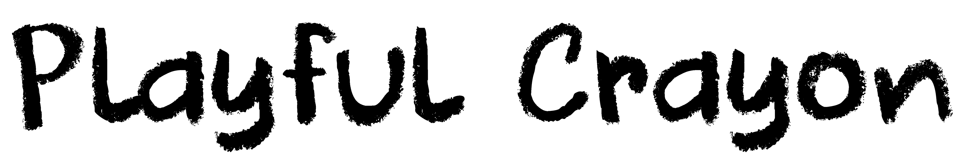
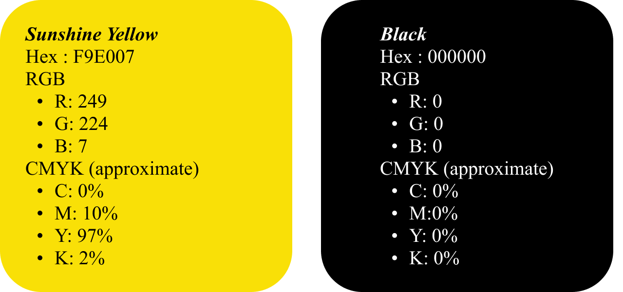
Ironing out type and color.
Cool Crayon + Sunshine Yellow.
DK Cool Crayon is a font that aligned well with the brand direction. It provides a clean, legible, and playful solution to display the logo type. This font was selected through a typographic compare and contrast exercise to understand the look and feel of Project Sunshine of San Diego's mission.

.....
Finding the symbol.
By leaning on my sketches, mood boards, and personas, I was able to create a unique one-of-a-kind symbol to represent Project Sunshine of San Diego.
But the question we kept asking ourselves was ...
Which face is the perfect face?

Googley Eye Face

Classic Modern Face

Classic Traditional Face

Blushy Face
I saw this as an opportunity to anonymously research and request feedback directly from our target audience. I released a survey asking participants which sun alignments with the foundational phrases of...
Childish yet Professional & Playful but Versatile.
With a total of over 90 survey participants, I was able to analyze their responses and identify that sun #4 was best aligned to the brand identity. This symbol was seen to be rooted in a childish, friendly, and unique visual appearance, as stated by survey participants. With this feedback, I was able to structure the logo pairing accordingly :)
......
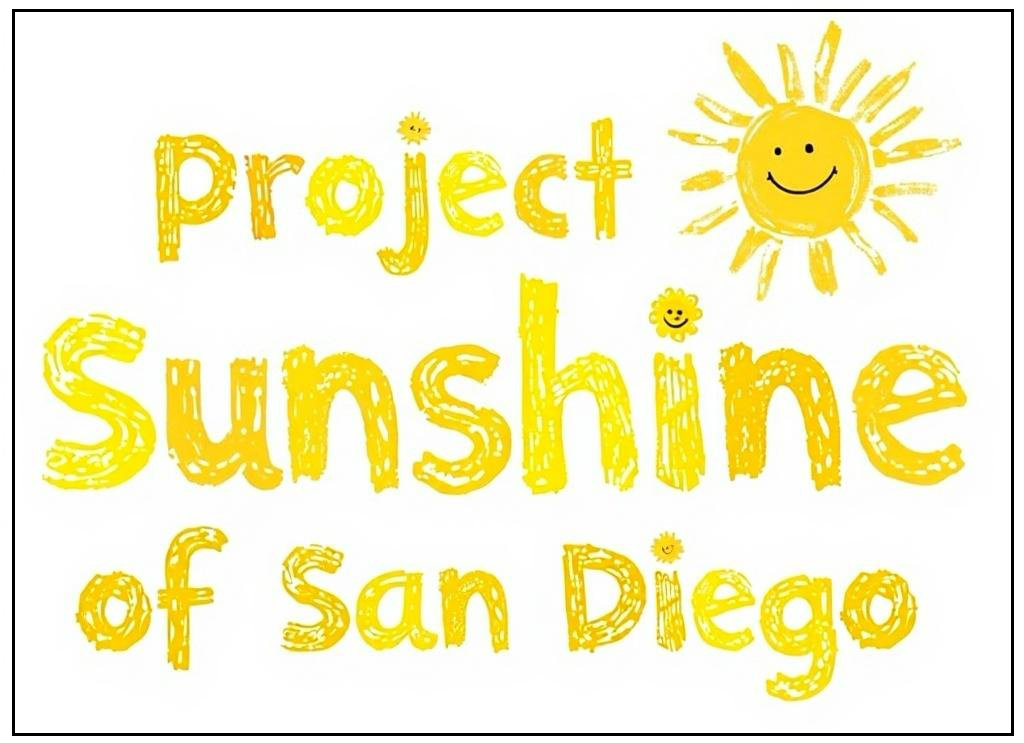
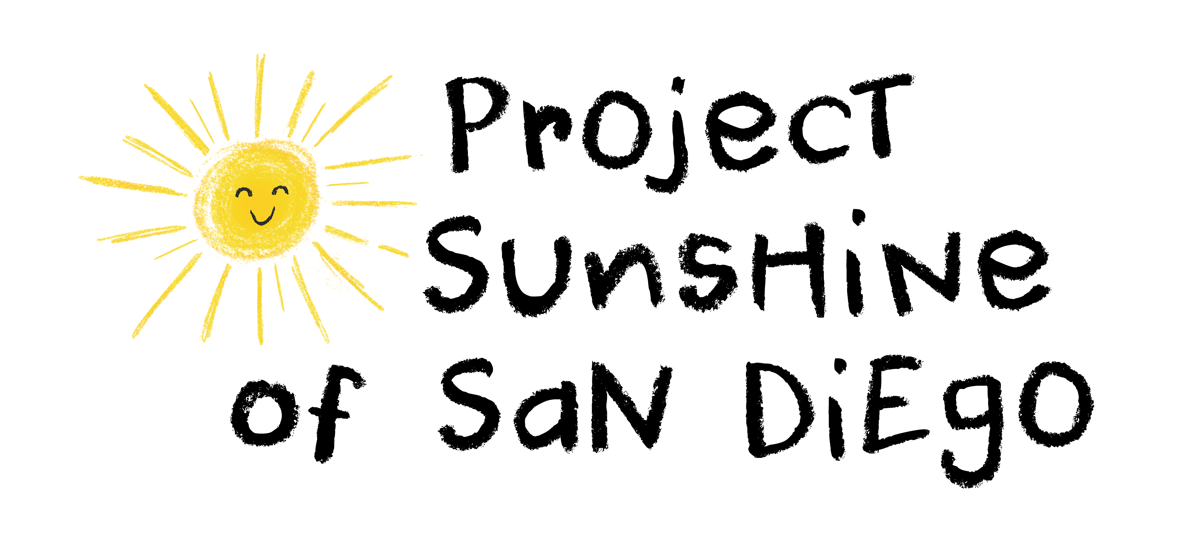
Final Logos.
This design solution was created by using Adobe Illustrator and Photoshop to provide a professional and one of a kind logos assets. By leveraging white space, using the golden ratio grid, and other desing principal, I was able to redesign a problematic logo to align with brand expectations. The export and organization of each asset was labeled with the correct asset-specific naming and folder organization.
1. Primary Logo.
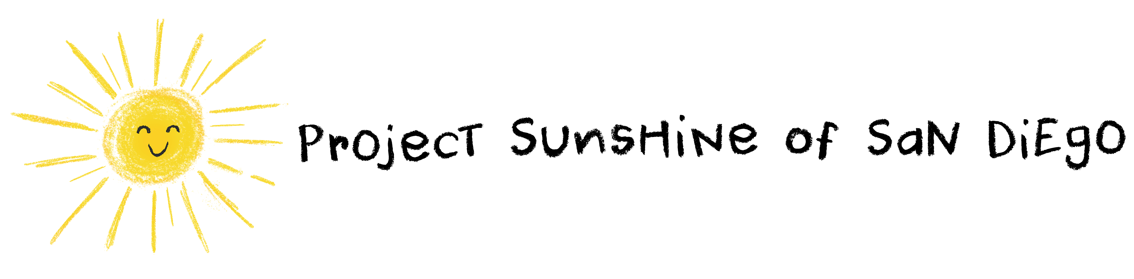
2. Secondary Logo.
3. Mockups.
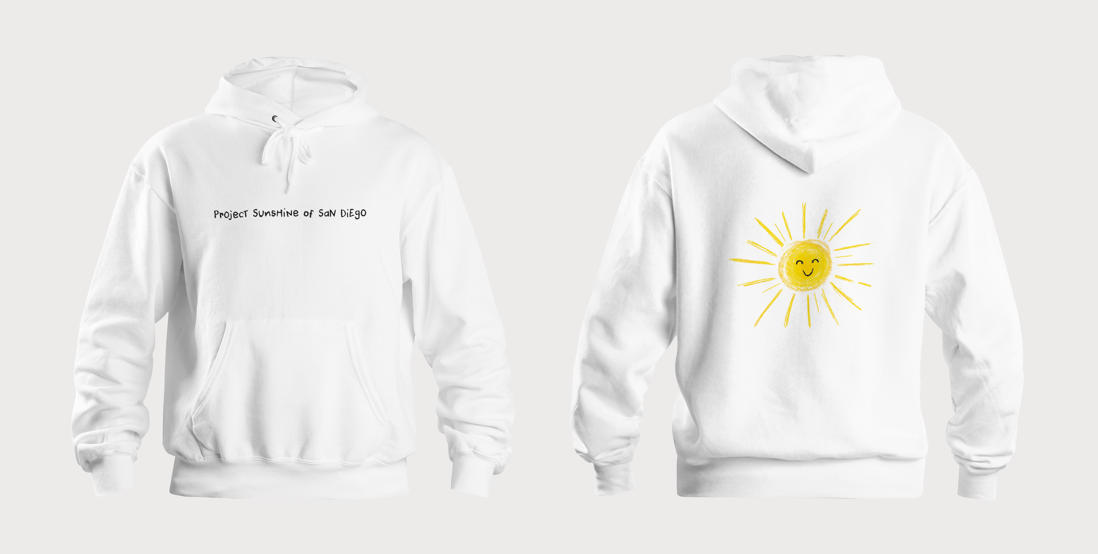
Sweatshirt Touchpoint
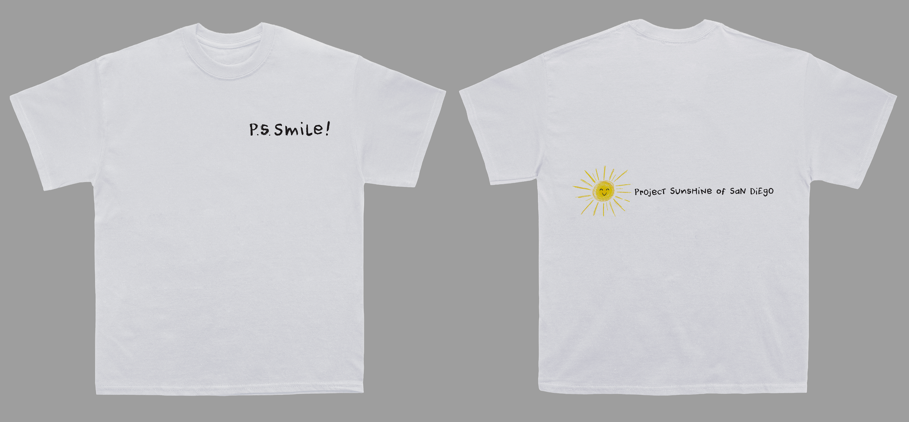
T Shirt Touchpoint
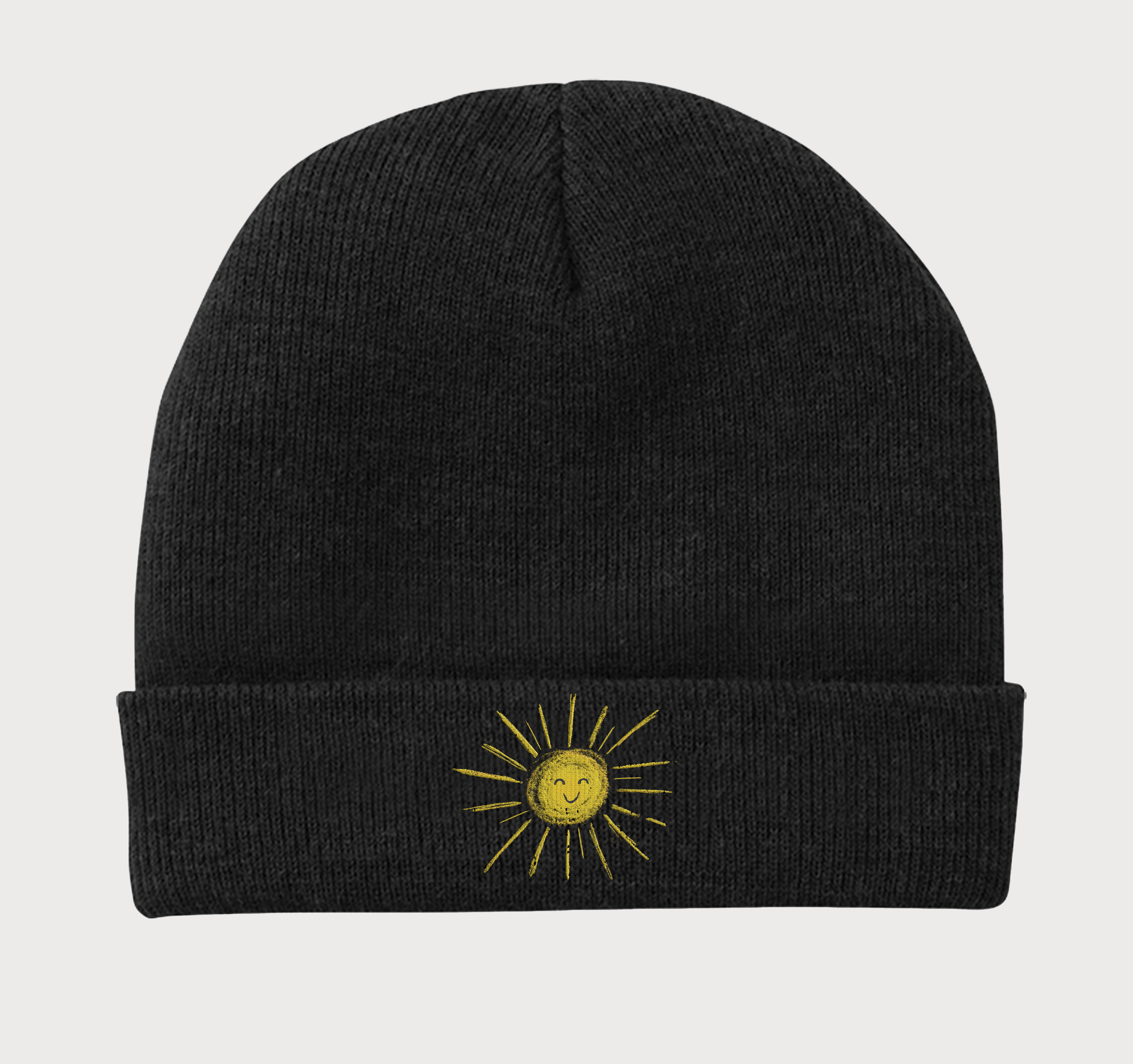
Beanie Touchpoint
.......
Key Learnings
1. Research-based decision-making directly supports the best visual for personas.
2. Export settings are valuable to communicate and document for client use.
3. Asset organization creates a simple and efficient workflow.