Index:
App Overview / Research Usability Study
Updating Accessability Concerns
Updating Usability concerns
Reflections
App Overview
FollowIt is a navigation-based app that allows users to plan for an upcoming trip, prepare for the journey, and prevent issues along the way. By collecting trip info, FollowIt is meant to get you to each stage of your destination with a step-by-step guide to support you in a new country or environment. In a real-world scenario, a user is meant to upload trip information before their journey through a simple survey process where FollowIt with auto-populate steps on how to navigate their journey when the time comes!
Updating Accessibility Concerns
Color: Text and Typography updates
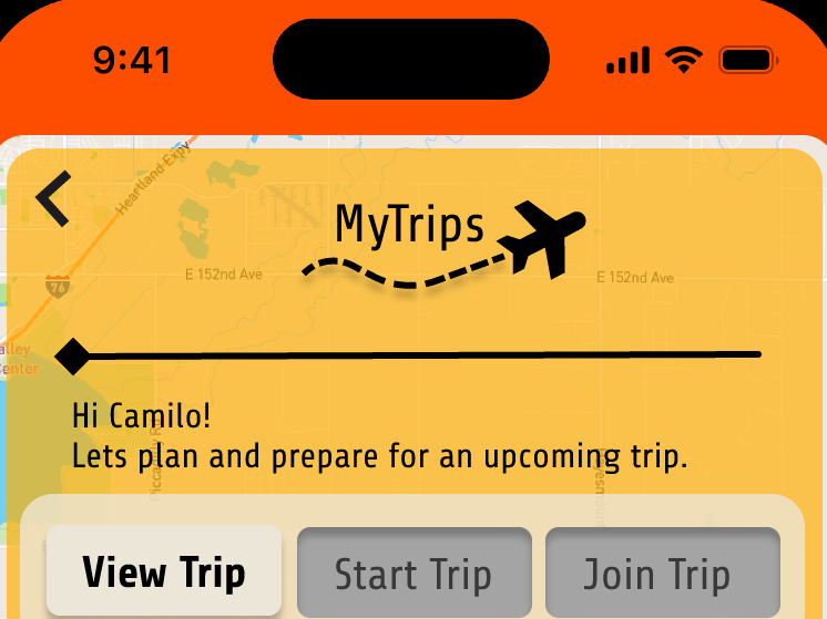
Before research, my design was full of color as I initially took a bold approach to support the experience. With my study I was given the feedback to reduce the color usage and opacity to ensure text and navigation were crystal clear. I took action by making it a high priority and circling back to the design step of development to transform the background color to communicate the expected flow easier.

Old Design

Updated Design


Old Design

Updated Design

Implementing this accessibility design update ensures that users can digest text and typography on each screen without the interruption of too much color. It resulted in a visually appealing design as well as following the accessibility standards using a color contrastor.
Features: Navigation and Layout
I wanted to ensure that the expected user flow was efficient and found an area of oppertunity in my home page design. By observing user behavior, I noticed how certain features were being overlooked. I had to ensure my home screen strategy was accurate for every button. I needed to implement the hover feature to all features accessible on the home screen to ensure a cohesive experience, as it is what users expect.

Old Design

Updated Design
By taking advantage of a haptic and hover element for each feature button, the expected flow is now cohesive and seamless. To ensure that this design would be seen without color, adding feature titles viewed while hovering over all features helps users understand every area of engagement.
Updating Usability Concerns
Community: Feature Engagement
When I was observing my test group engage with my features, I noticed low engagement with our Community feature due to missing information that users need to manage their communities. Feedback said the community was difficult to digest due to unecissary space. I took on the task to restructure our Community feature with simplicity and access in mind to help nudge user behavior to correct experience.

Old Structure

Updated Structure

Listening to my users, I updated the structure of our community feature to highlight navigation, information, and easy access to engagement. This structure is easily approachable and professional to support all users from different technological backgrounds in navigating this feature easily.
Pre-populated Communities are listed above the selected community and hold a variety of new topics with a horizontal scroll. Community, Profile, and Post cards stand out with bottom navigation.
Signs and Symbols: Nudging Behaviors
I noticed that users did not enjoy the large amounts of tests in my original design as it was hard ot digest and lot visually unappealing. I focused on eliminating as much copy as possible and replacing each area with a symbol. I knew that taking the text out and replacing it with a visual would support the user experience with a design enhancement. The new updates to prioritizing Signs and symbols resulted in a simple and digestible layout of information. Users can now understand their important trip info/navigation/community more easily.

Updated with Symbols

Icon Usage

Filters Replaced with Icon Only
Reflections
Takeaway on AccessabilityResearch
Through my research and accessibility updates, I gained a much deeper understanding of how inclusive design practices benefit all users with diverse backgrounds. I learned that accessibility is not a separate feature, but something that needs to be built into every aspect of the design process from the start. Implementing changes like improving color contrast, adding clear labels, and ensuring navigation is accurate has helped me see firsthand how small adjustments can open up access to a much wider audience. This experience also made me more aware of industry standards like WCAG and emphasized that accessibility work is an ongoing commitment, not a one-time fix.
Takeaway on Usability Research
In this design sprint, I learned that even small usability improvements can have a major impact on the overall user experience. Implementing updated design changes based on usability feedback taught me the importance of simplifying interactions, clarifying navigation, and minimizing user confusion. I realized that design isn't just about visual appeal — it's about making sure users can accomplish their goals quickly and easily. This experience reinforced the value of user testing at every stage and showed me that intuitive design often comes from carefully listening to how real users engage with a product, not just relying on assumptions.


