-------------------------------------------------------------------------------------------------------------------------------------------------
What to expect:
Project overview
Problem to solution
- Initial concept development
- Prototypes
- User research
Final prototypes
Reflection
FollowIt - Idea
Whether you are traveling for business, leisure, or running away from your problems, the most important step is to prevent, prepare, and stay proactive for your journey ahead. With over 1.4 billion international tourists recorded around the world, there are millions of people having to navigate a foreign airport experience every day.
If you are looking to minimize airport friction, get journey support for any destination, and maximize your energy in a new city/country, all you have to do is FollowIt.
With in-depth, user-friendly instructions on how to efficiently navigate your destination, FollowIt goes above and beyond in supporting travelers around the world. Travelers worldwide want the fastest way to navigate their journey, and by using FollowIt, you can...
~ Understand your journey ahead, before you depart for your trip.
~ Follow the easy instructional navigation during your journey.
~ Receive personalized updates (safety/informative).
~ View suggested journey highlights.
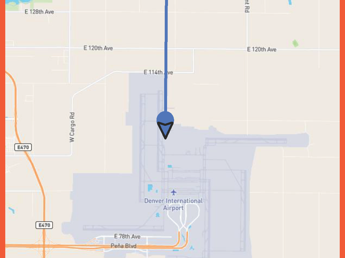
Every step of your travel journey will be simply handed to you after providing flight info to get you from point A to point B as efficiently as possible. To start your trip, FollowIt will support airport traffic, ensure safety in ground transportation, and digitize the airport's expected flow for you.
My design process
When creating FollowIt, I wanted to design for any type of user who might approach my product. I started by focusing on the flaws that currently exist with airport navigation to build a design solution. By deconstructing the complexity of this problem, I designed an end-to-end solution with a navigation-based app.
The initial concept development consisted of putting my ideas on paper to pitch this app to my peers. In this first phase, I took time identifying the problem, target audience, feature requirements, and each touchpoint I'd have to design for. This two-week brainstorming period gave me the chance to set the foundation for my project. By pitching this strategy to my peers, I received feedback, which initiated my flowchart after collaborating on my research.
This flowchart shows how each feature can be used on the mobile experince.

FEATURE THREE / Flowchart

FEATURE FOUR / Flowchart

FEATURE TWO / Flowchart

FEATURE ONE / Flowchart
Prototype Screen Design
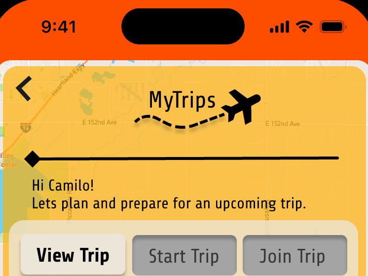
The following screens showcase the evolution of FollowIt across mobile, desktop, and wearable platforms. Each design reflects a user-centered approach, emphasizing intuitive navigation, accessibility, and seamless interaction tailored to the specific context of use.
From the dynamic, on-the-go functionality of the mobile app to the comprehensive planning capabilities of the desktop interface and the quick, glanceable information provided by the wearable prototype, these designs illustrate a cohesive experience that adapts to users' needs across different devices.
The visual consistency and thoughtful layout across platforms demonstrate a commitment to delivering a unified and engaging user experience.
Usability Test / Feedback / Design Updates
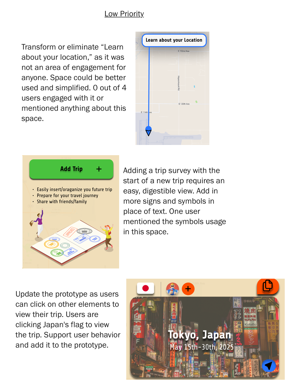
My research summary consisted of two main ideas being user areas of engagement and understanding the use of Visual elements. I wanted to figure out how users are navigating the expected flow and what catches their attention the most/least. I found that right off the bat, there was an area of confusion on my home screen where a hover effect was providing conflict with where a user can navigate. In our main feature “NavigateMe,” the button is the only item without a hover effect because it has enough space to write out its words without a hover, but the fact that there was no hover made people think that you can not click there. People were more interested in engaging with the other three features instead of NavigateMe due to the visual limitation. When users landed on the home page, it seemed as if our feature “My Trips” was clicked on the first 75% of the time, meaning that it caught users' attention the most on the layout of the screen.
Certain users called out the color and use of symbols for my design, explaining that symbols were helpful and accurate to understand the content, as well as what to expect with a click. Others mentioned that the color scheme was somewhat overpowering when used throughout the application, but they could see why it were implemented. Initially, each feature has a background correlated with a specific color, but I think the color needs to be more subtle and or used differently, as it should not overpower the design elements. In reference to what caught people's eye, I found that when digesting heavy trip information, the additional symbols for takeoff/landing/accommodation were easily digestible, which is a success.
Making sure users can navigate our application easily and efficiently is our number one priority, and implementing the symbols was helpful for this mission, while reducing color in our design could support our design even more. As for areas of engagement, My Trips was most interesting in our test and identified certain areas of high clicks to view trip information to be successful. Overall, testing feedback was helpful, and these new design elements are going to result in a seamless experience.
Quantitative Findings
Qualitative Findings
Feedback Into Design Updates


Figma Prototypes
FollowIt Mobile Prototype
FollowIt : Desktop Prototype
FollowIt : Wearable Prototype
In concluding the FollowIt case study, this project has been a comprehensive journey in user-centered design, emphasizing empathy, adaptability, and consistency across multiple platforms. Through the development of mobile, desktop, and wearable interfaces, I honed my skills in responsive design, accessibility, and cross-platform integration. Each phase, from initial concept development and user research to prototyping and iterative testing, reinforced the importance of aligning design decisions with user needs and behaviors. The successful implementation of FollowIt across these touchpoints not only demonstrates technical proficiency but also a deep understanding of creating cohesive and meaningful user experiences. This project has solidified my ability to approach design challenges holistically, ensuring that solutions are both functional and empathetic to the end-user.
Sources and Citations
https://www.unwto.org/un-tourism-world-tourism-barometer-data
https://travelpro.com/blogs/the-travelpro-blog/how-to-navigate-an-airport#:~:text=Airports%20can%20be%20big%2C%20daunting,the%20place%20like%20a%20pro.
https://medium.com/@AndrewCave/intuitive-airport-navigation-two-insights-about-search-and-familiarity-3d7c04463f5e
https://www.pygmy-elephant.com/blog/7-ways-to-navigate-airports-stress-free
