The decline of Tinder.
Match Group Inc.

Historically, Tinder has been one of the most popular dating apps, well known for being an innovative approach to online dating. In recent years, it has lost its brand respect due to its artificial connectivity and confusing brand presence. Users have been asking themselves;
Is Tinder just a hookup app? Am I going to get catfished if I swipe right? Is this safe?
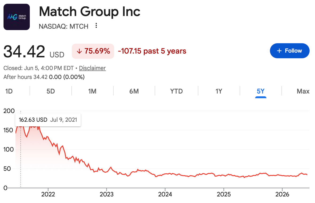
These hesitancies caused a shift in the industry, where Tinder was dethroned from being the global leader for Match Group Inc in both downloads and revenue. The massive user base across more than 190 countries has declined rapidly in the last five years, as it has seen a decline in demand.
▼
The design solution.
I saw this as an opportunity to redesign their brand assets to align better with their original mission and motive.
Seeing this decline as a designer, I was hyper aware of the power behind brand identity and recognized that Tinder has dug a hole that they cannot get out of with their current brand presence to blame. Their current logo is now a symbol for hookup culture and no longer resonates with their target audience. In order for Tinder to be seen as appealing to new generations, it must lean into industry expectations and honor meaningful connections.

▼
I started with a brand audit.
By taking a research initiative to understand Tinder's current brand guidelines, perception, and philosophy, I was able to analyze three main points of interest to take into account in a potential redesign.
1. Tinder has good intentions but an aggressive execution.
2. Tinder's current assets need to evolve to represent a real connection.
3. Tinder needs to attract monthly subscribers.
Then I researched the audience + Competitors, which supported me in identifying the new brand strategy.
I decided to redesign Tinder's brand identity to provide a digital presence that is rooted in human connection and a revenue-driving appeal. (while still protecting the brand they've built).
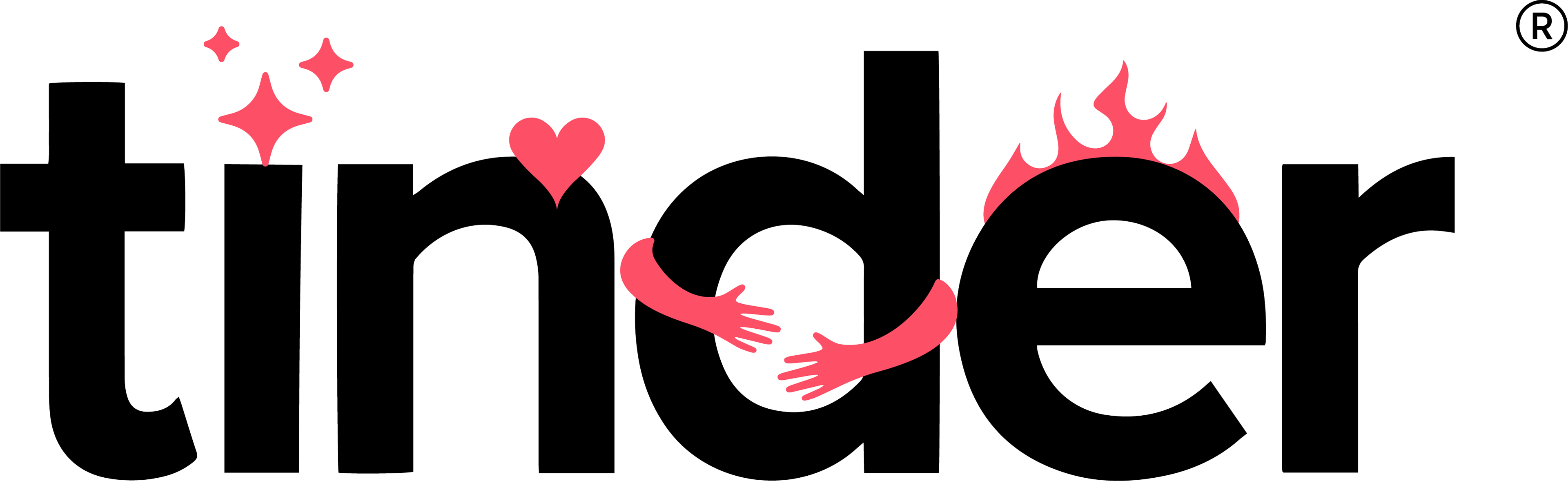
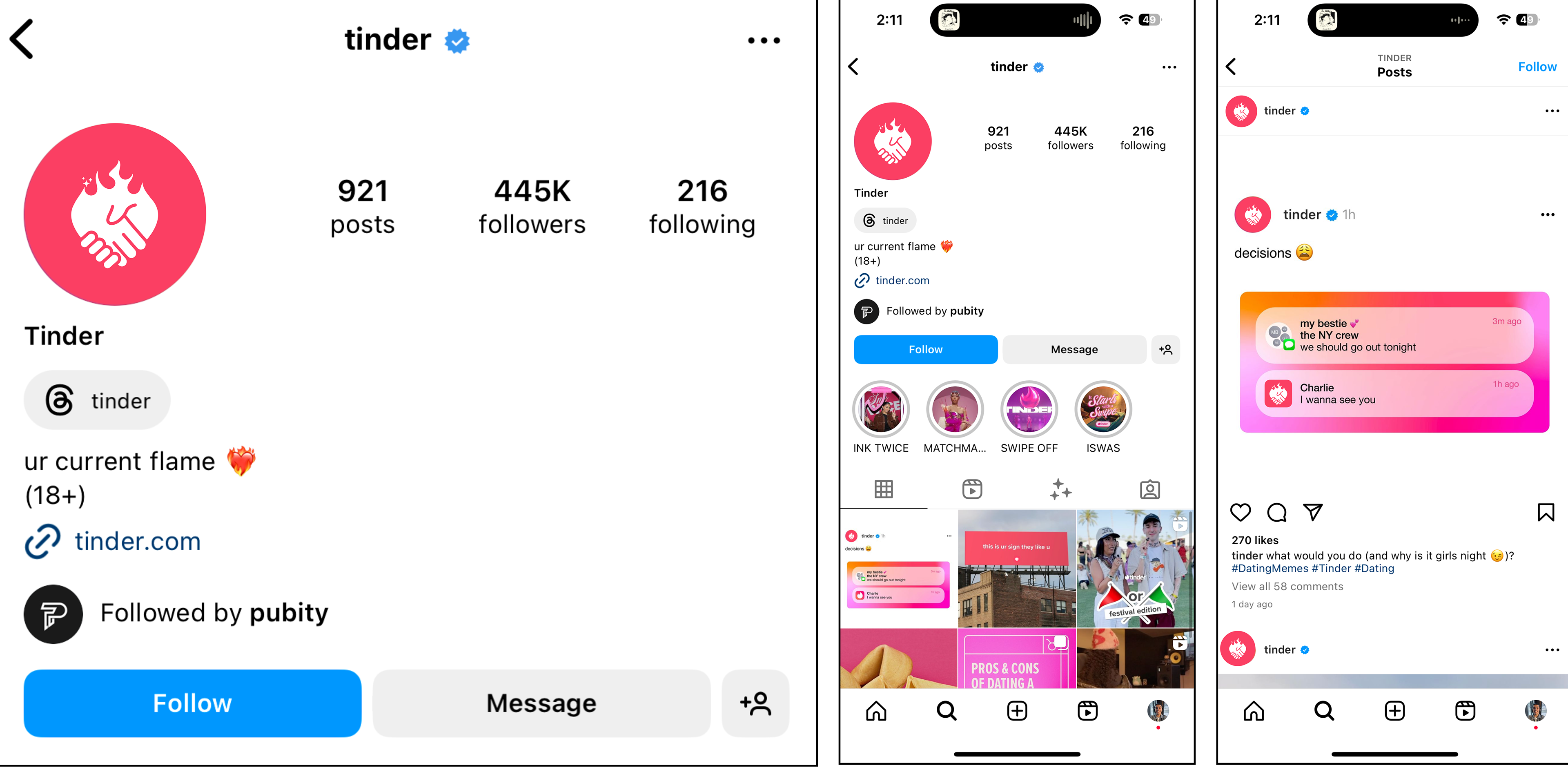
Symbol.
I transformed their current flame symbol to reflect every type of connection you might find on Tinder, whether you are looking for friends, dates, or connections. I believe Tinder should steer away from a flaming hot symbol and evolve its classic flame to nurture any type of connection you might find on Tinder.
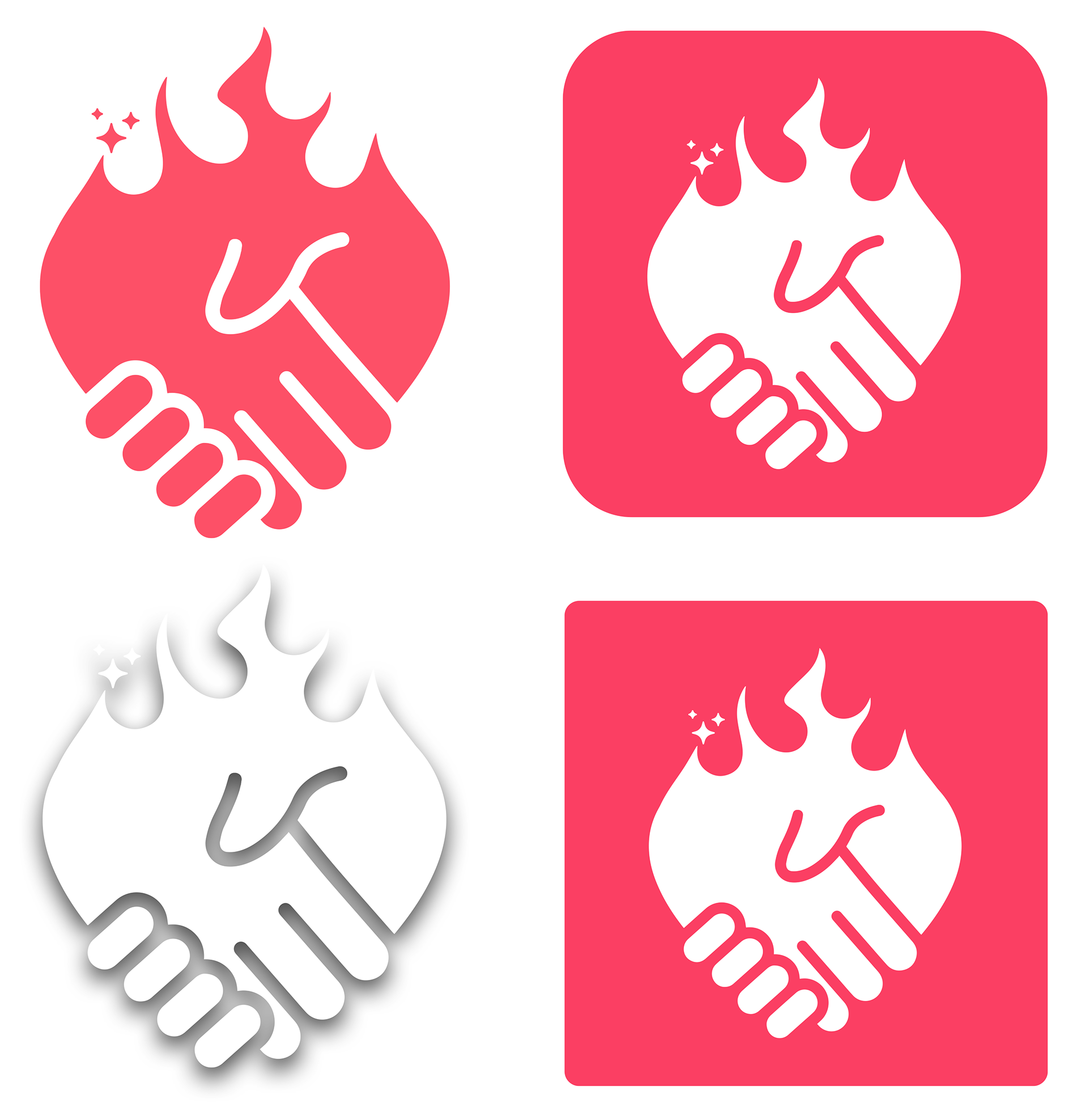
New Symbol
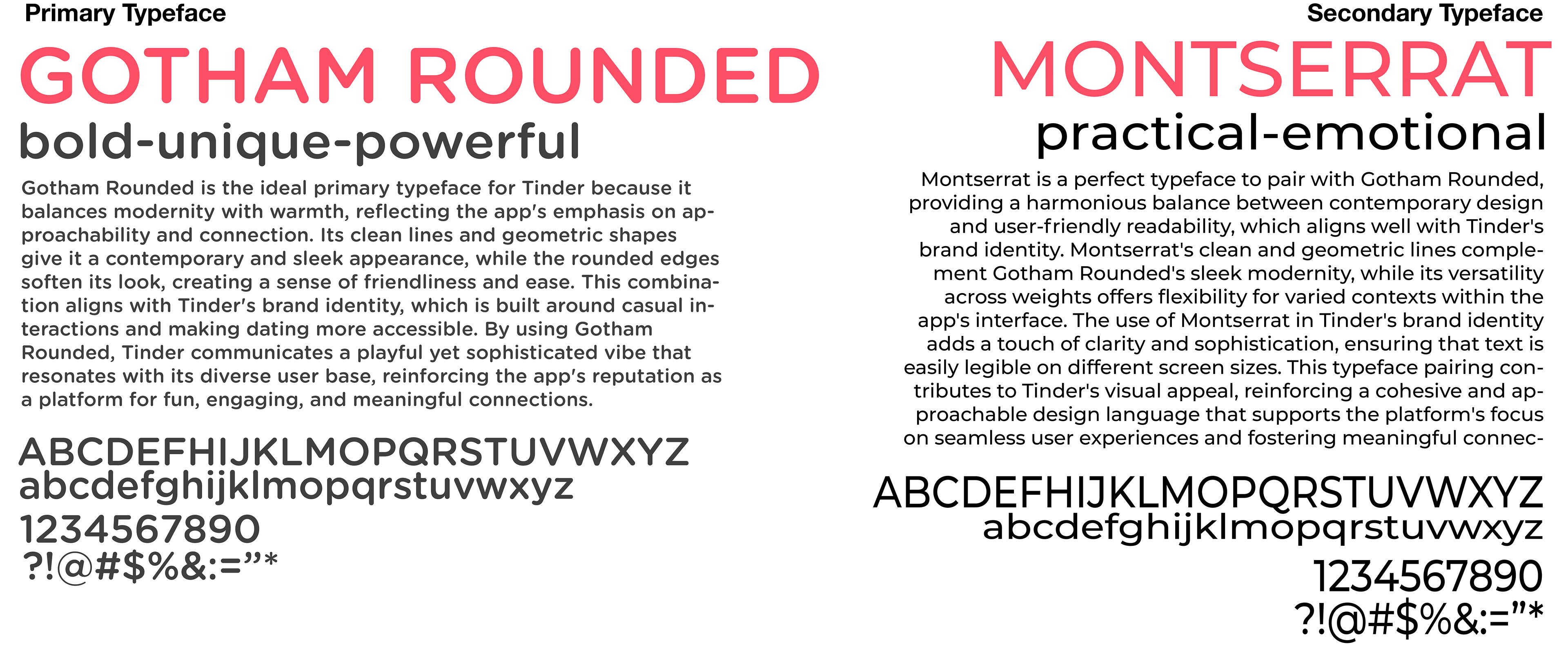
Typography.
I used Tinder's current brand typography to reflect consistency and resonate with users. When researching Tinder's brand guidelines, I found that it was important to keep the original font choice to convince audiences of this rebrand.
▼
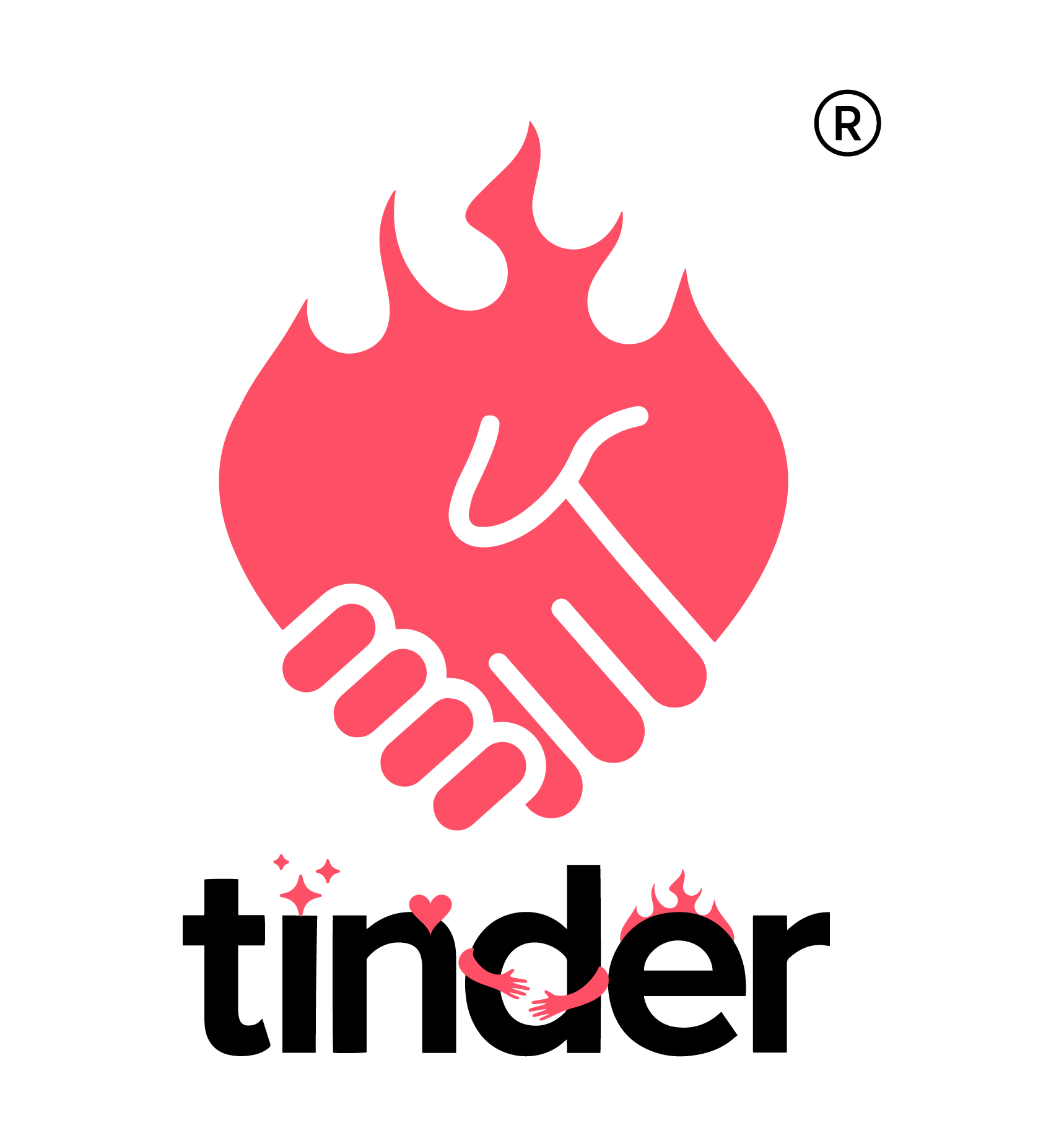
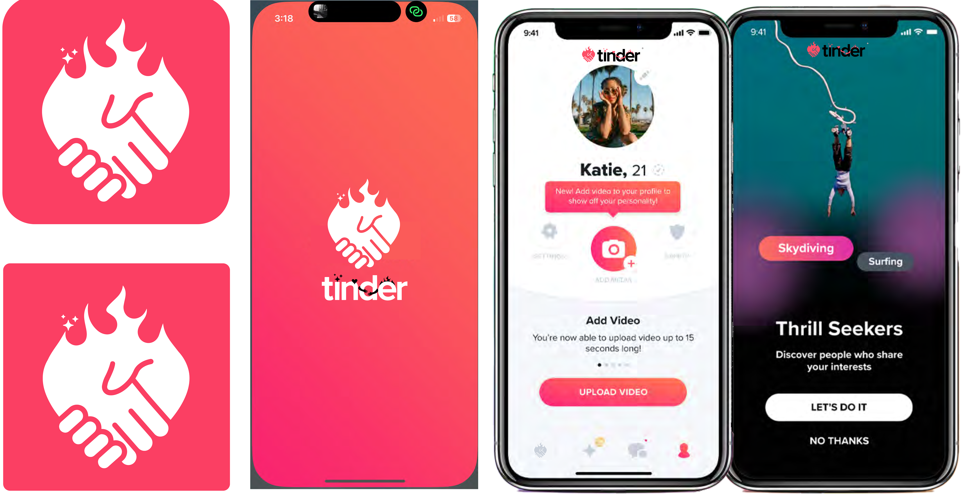
Final logo + Touchpoints.
Primary logo.
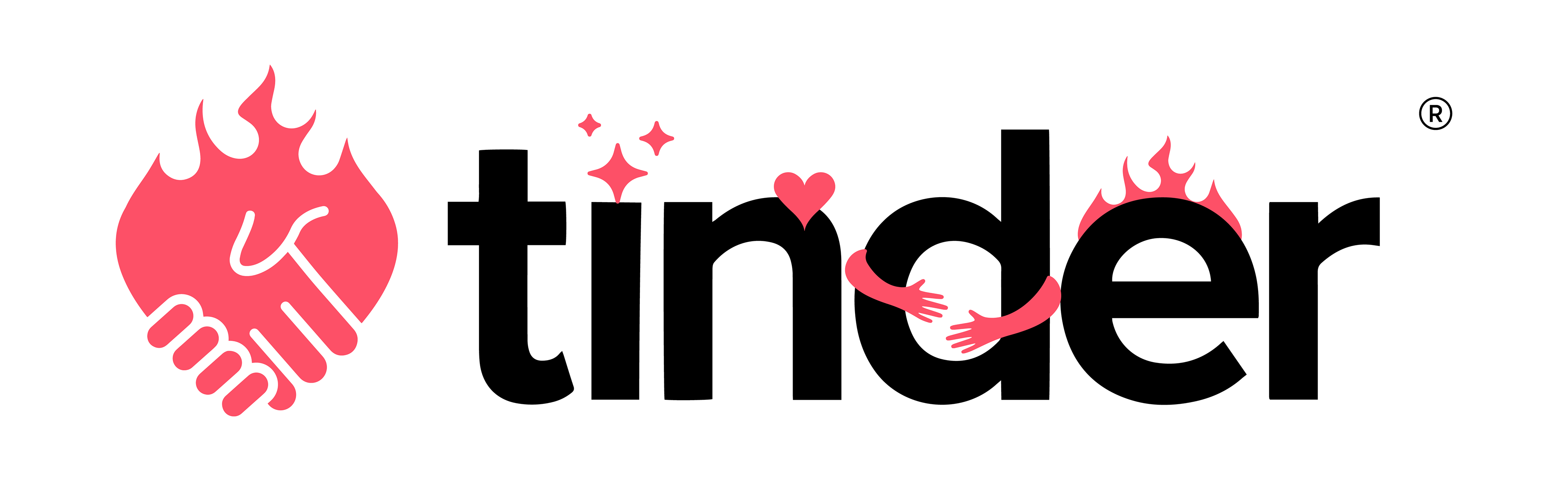
Secondary logo.
Divisional logos used for monetization.
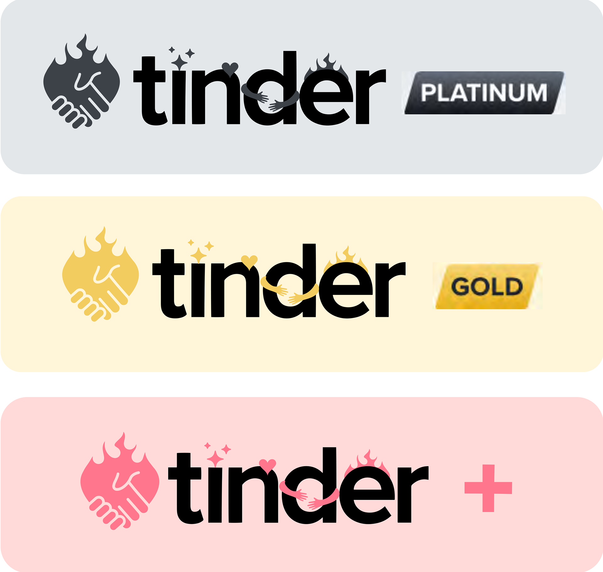
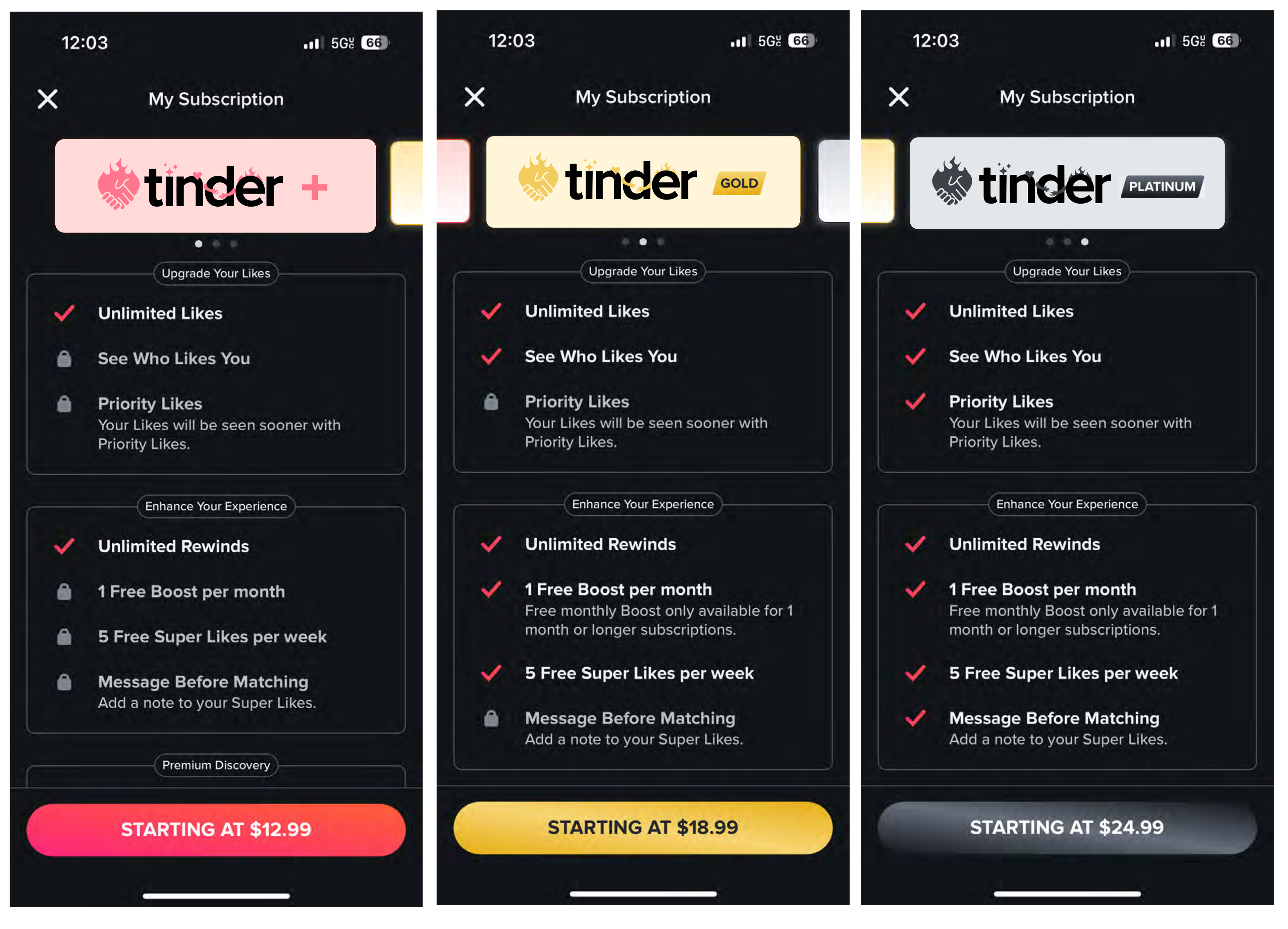
A key learning I noted was that revenue-driving features on a digital product need to be designed for promotion, exclusivity, and value. I focused on creating value around Tinder's tiers of subscription, as it invites users to an experince. With tertiary colors and premier badges, this design persuades a user to recognize a promotion.
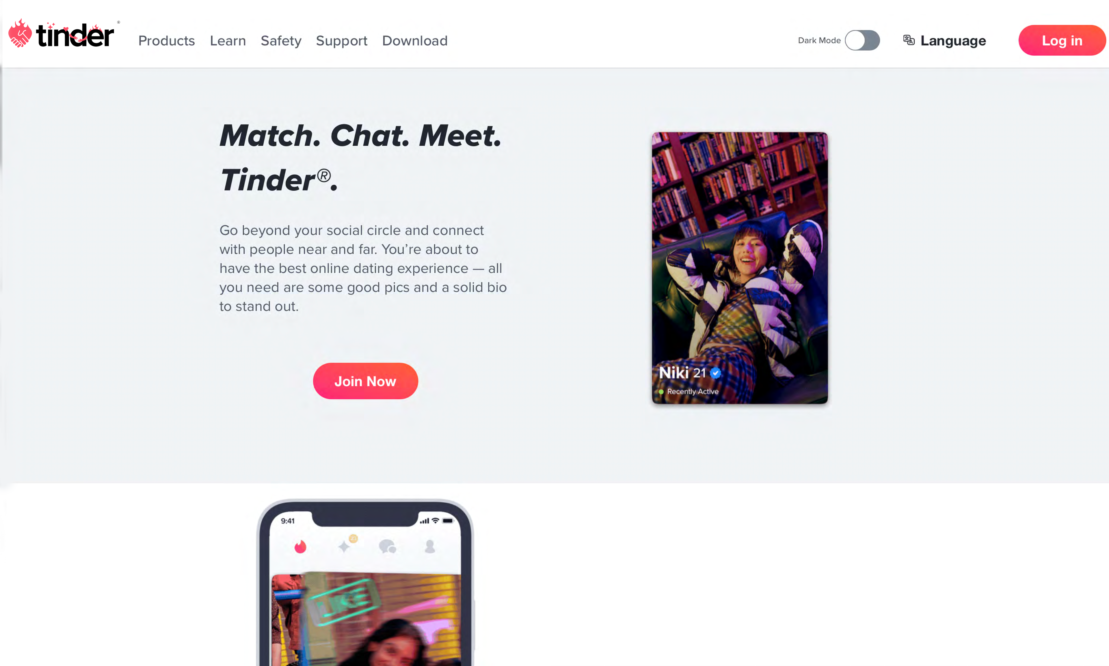
In app and web.
Social Media.
▼
Key Learnings
1. Designing an end-to-end asset refresh is a thorough process where organization is the root of success. I used folder and project organization basics to set myself up for efficiency.
2. When designing for a monetization screen, you are persuading users to sense value.
3. This is an example of how design influence can solve a business problem.